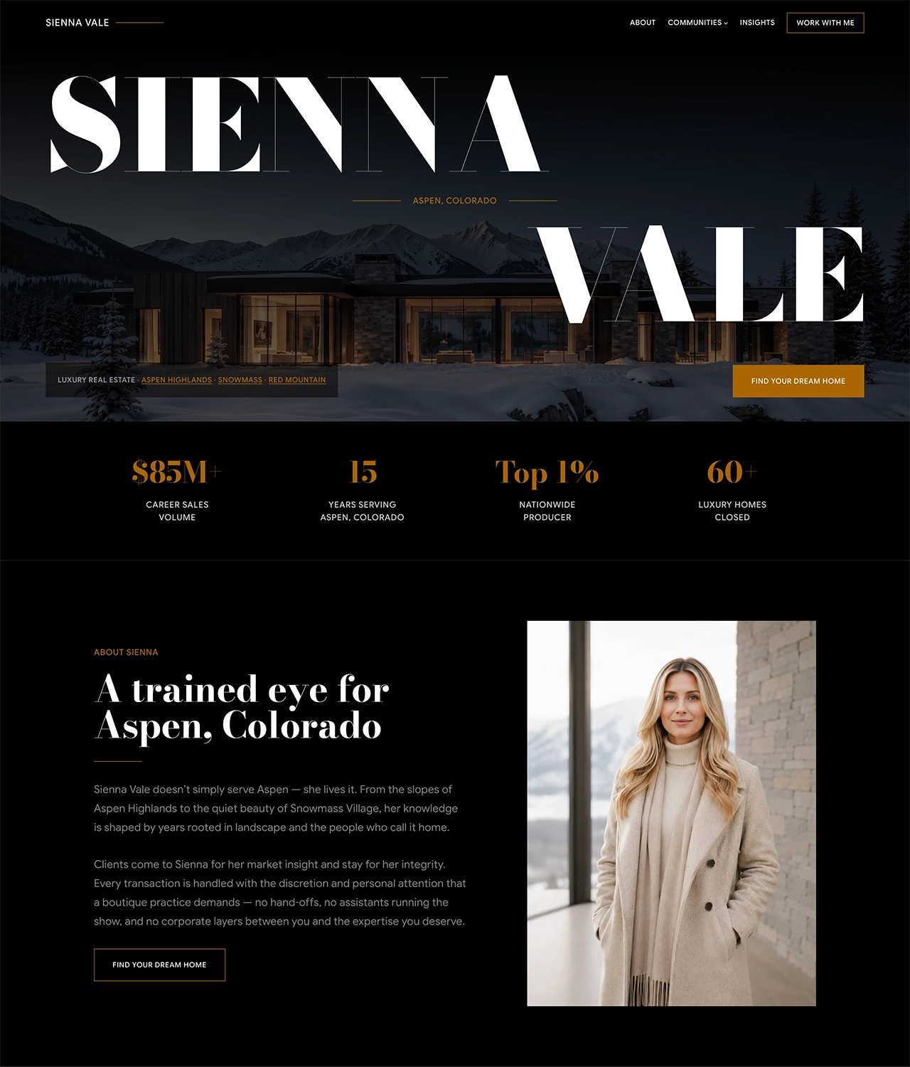
Authority is more than style.
It’s a decision.
Suede is a refined design system centered on authority and presence. Its visual language favors strong typography, generous space, deliberate contrast, purposeful imagery, and confident composition.
Defined in DESIGN.md — the complete design system in one readable file.
01
Principles
01
Prefer fewer, stronger ideas.
Decide what deserves attention and give it scale, weight, and room. Remove anything that weakens the message.
02
Hierarchy before decoration.
Establish priority through type, spacing, form, and contrast. Let those elements work before adding anything more.
03
Space makes things matter.
Give content enough room to breathe. Apply it with true purpose, not just for visual effect or unnecessary decoration.
04
Repetition creates coherence.
Use consistent patterns to build familiarity and rhythm. Introduce variation only when the content calls for it.
05
Restraint, not minimalism.
Be selective while preserving balance, character, and depth. Compositions should always feel confident and complete.
02
Identity
The mark
Two parallel strokes form a simple, deliberate mark. Geometric and disciplined, it reflects the principles behind Suede: strong composition, clear hierarchy, and the confidence to use less.
Gold on black / white is the primary treatment. Monochrome alternatives provide flexibility where scale, contrast, or context calls for restraint.
Aspect
1 : 1
Stroke
1 unit
Spacing
2 units
03
Typography
Google Sans Flex — primary
Aa Gg Rr 24
85% condensed
Presence
100% normal
Presence
110% expanded
Variable width creates contrast while preserving typographic continuity, used selectively and with purpose. Secondary or accent widths introduce distinction when they strengthen the editorial character of the design.
Type scale
12px
Suede
xxxSmall
14px
Suede
xxSmall
16px
Suede
xSmall
18px
Suede
Base
20px
Suede
Small
24px
Suede
Medium
30px
Suede
Large
36px
Suede
xLarge
48px
Suede
xxLarge
60px
Suede
xxxLarge
Body — 18px / 400
The base body text is set at 18px and 400 weight with generous line height. Headings use 500 weight with tighter spacing. Use 600 weight for strong emphasis, and keep text links identifiable, typically with an underline.
Eyebrow / Spacing / Meta
Uppercase · 0.05em · 500
Reserved for navigation, labels, metadata, and eyebrow treatments. Use selectively to establish hierarchy and distinction, never for long-form copy or prominent display typography.
04
Color
Black and white define the foundation. Gold is used selectively — for identity, emphasis, and interaction — adding distinction without competing for attention.
Black — authority, contrast
#000000
White — restraint, balance
#ffffff
Gold — identity, presence
#aa6600
Directional gradients
Functional, not decorative. Use when imagery needs contrast for overlaid content or when a composition benefits from controlled tonal depth.

Fade down
Fade up
Fade right
Fade left
05
Layout
Dimensions
640px
Content width — Long-form text and focused reading
960px
Mid width — Text paired with supporting content
1280px
Wide width — Imagery, covers, and complex grids
Keep long-form text focused within the reading measure. Let imagery, covers, grids, and expressive compositions expand into the wider canvas.
Spacing
20px
30px
40px
60px
80px
100px
Smaller values connect related elements; larger values separate sections, ideas, or visual modes. Give major sections more room to breathe.
06
Detail
Buttons
On white
Accent fill, uppercase text at medium weight. Choose border radius and apply it consistently. Outlines follow the same form.
Buttons
On black
Accent fill, uppercase text at medium weight. Choose border radius and apply it consistently. Outlines follow the same form.
Shadows
Soft shadow
Solid shadow
Subtle shadow
Iconography
Material Symbols Sharp, 200 weight, 48px optical size. Use selectively and at balanced scale to clarify intent — never just as decoration.
07
Motion
If you notice the animation, it’s too much.
Motion reinforces hierarchy and focus without drawing attention to itself. Meaning must never depend on it — every state remains clear without motion.
fadein
opacity 0 → 1 · 500ms
Arrive without direction
For content that appears naturally, without suggesting direction.
fadeinup
opacity + 30px · 500ms
Guide attention upward
For content that benefits from subtle movement as it enters.
Image zoom — hover state

Image zoom is reserved for imagery — never apply it to text or interface elements.
Motion defaults
250
ms
Interface transitions
500
ms
Entrance animations
30
px
Entrance distance
1.05
x
Image zoom effect
08
Application
One system.
Distinct expressions.
Every expression starts with the same system — distinction emerges in how its design principles are interpreted and applied.
The system at work:
Expansive imagery
Strong contrast
Expressive type pairing
Editorial design
Restrained color
Subtle use of motion