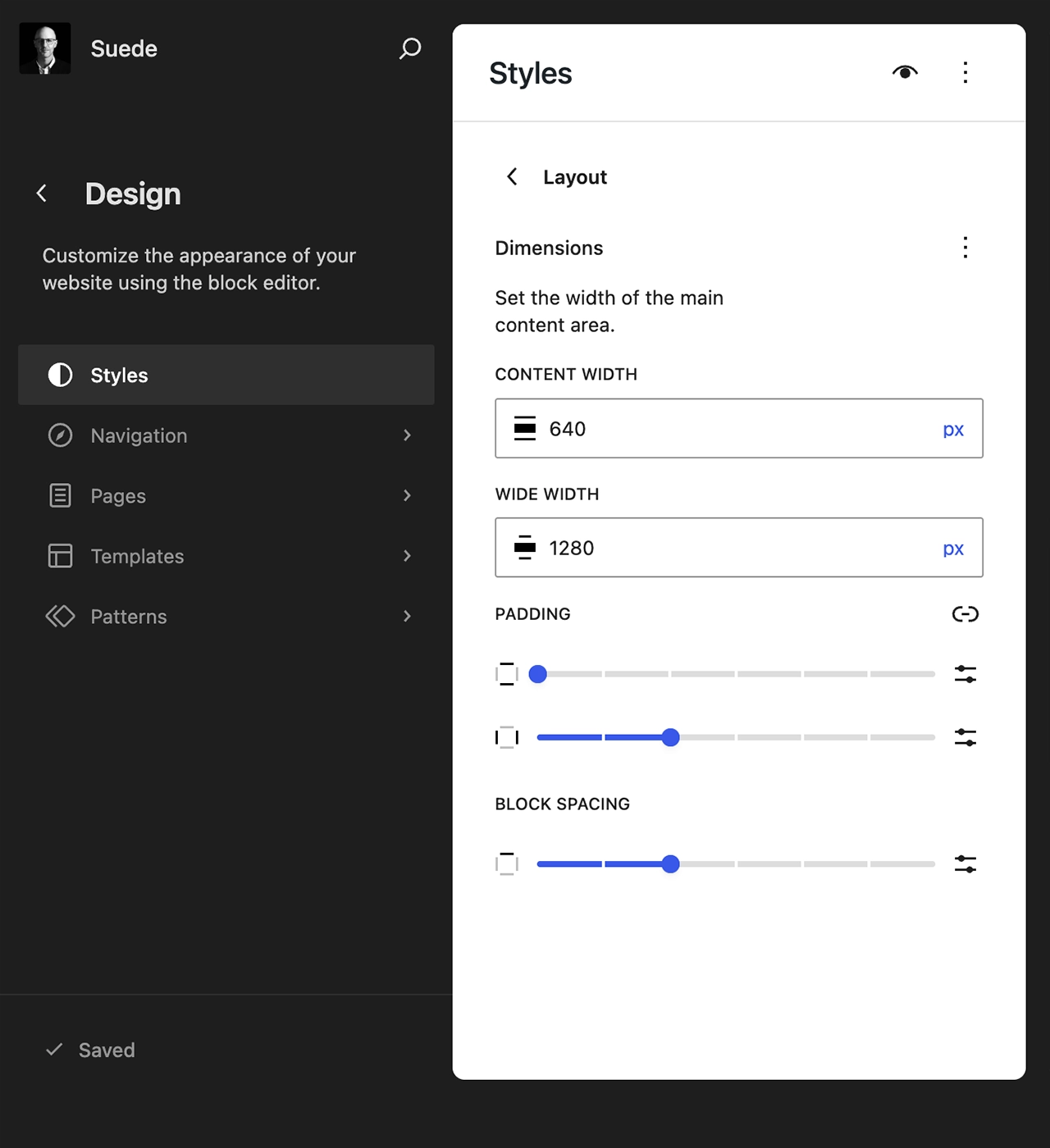
Suede uses two WordPress layout settings to define the maximum widths for standard and wide content throughout the theme:
- contentSize, which establishes the default width for blocks in both the editor and the front end
- wideSize, which activates the wide-width feature and sets the width for wider blocks
Suede defines content width using two layout settings: contentSize and wideSize. By default, these values are set to 640px and 1280px, respectively. Both settings can be customized by editing theme.json directly or through the WordPress Site Editor without writing code.
Set Content Width (Code)
Below is the code used to set content widths in theme.json:
{
	"settings": {
		"layout": { "contentSize": "640px", "wideSize": "1280px" },
	}
}
Additionally, fluid typography settings should changed to match:
{
	"settings": {
		"typography": {
			"fluid": { "minViewportWidth": "640px", "maxViewportWidth": "1280px" },
		}
	}
}
Set Content Width (No-Code)
Go to Appearance > Editor > Styles > Layout, and you will see a panel like the one below. Change the values for Content and Wide as desired.