Every design system like Suede needs a recognizable signature.
Not because a mark defines the work, but because it creates a consistent point of recognition wherever the work appears across every medium.
That signature needed to feel as deliberate as the system it represents. It could not rely on decoration, symbolism, or stylistic effect. It needed to be simple, precise, and capable of becoming familiar through repeated use.
The result is the Suede mark.
Introducing the Suede mark
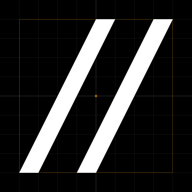
The Suede mark is constructed from a simple geometric system. It consists of two identical parallelograms within a 512 × 512 square. Each bar is 64 pixels wide with a 128-pixel gap. The mark is never stretched, rounded, or altered.
Every dimension is derived from the same underlying geometry. The system determines every proportion, leaving nothing to subjective refinement.
The mark remains consistent at every scale and in every context. Whether it appears as a favicon, a social avatar, or an embossed impression, its identity is defined by proportion rather than surface decoration.
A signature identity
The Suede mark is intentionally abstract. It does not depend on symbolism, metaphor, or hidden meaning to be immediately understood.
Its purpose is simpler: to identify Suede wherever it appears.
That restraint is intentional. Rather than asking to be interpreted, the Suede mark earns its meaning through repeated association with the product, the design system, and the work created with it. Like the imprint of a publisher, it becomes meaningful because of what it consistently accompanies.
It is less a symbol than a signature.
Designed to endure
Design trends change. Software evolves. Products mature.
A visual identity should outlast them all.
For that reason, the Suede mark is fixed. It is never stretched to fit, softened to follow trends, or unjustly modified for decoration. The same visual design appears everywhere, reinforcing recognition through consistency.
Its simplicity allows it to move between contexts without losing its character.
At small sizes, the mark remains unmistakably clear and easily recognizable. At larger scales, the underlying proportions become more apparent. In black, white, or gold, the mark is defined by form rather than effect.
That consistency carries across every application of design—whether used in favicons, site logos, documentation, social avatars, or watermarks.
A reflection of Suede
The mark reflects the same philosophy as the rest of Suede.
It favors geometry over ornament, consistency over novelty, and restraint over expression. Every relationship is intentional, and every dimension belongs to the system.
Like the product it represents, the mark is designed to support the work rather than compete with it. It creates recognition, then quietly recedes.