Sometimes it’s the little things in design that matter. Joshua Becker of Becoming Minimalist recently asked me to redesign the No Sidebar website—a project grounded in simplicity, whitespace, and clarity.
I rediscovered a small but powerful CSS property—text-wrap: balance;—that improves how multi-line text flows. It’s a subtle touch, but one that brought unexpected polish and harmony to the final design.
This one CSS property helped get me there. By evenly wrapping multi-line text, especially headlines, it removes visual tension and makes things feel more intentional. It’s not flashy, but the difference is noticeable.
On a site like No Sidebar—built on simplicity and whitespace—that kind of balance matters. It’s a simple touch, but it brought the design to life.
The magic of text-wrap: balance;
Here’s an example of what I mean. Before applying any adjustments, headlines with longer titles often broke in awkward places, creating uneven line lengths that felt visually off, especially on narrower screens.
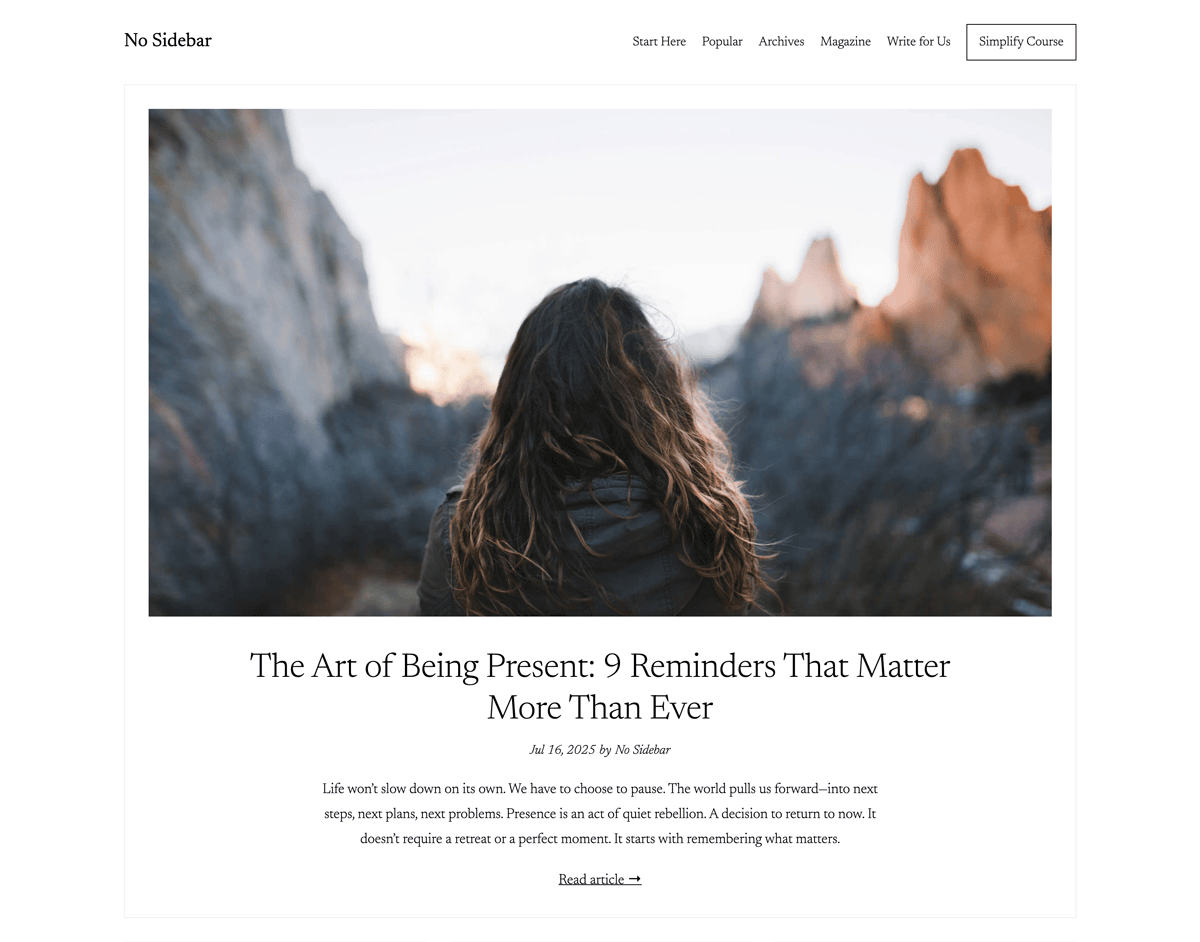
With text-wrap: balance; applied, the difference is clear. Headlines on the homepage wrap more evenly, creating a cleaner, more intentional, and visually balanced look that aligns perfectly with the No Sidebar aesthetic.