A few months ago, I was surfing around looking for some design inspiration when I came across the Viget website. The typography instantly grabbed my attention; it simply had that certain ‘je ne sais quoi,’ so I dug a little deeper to see which font was being used.
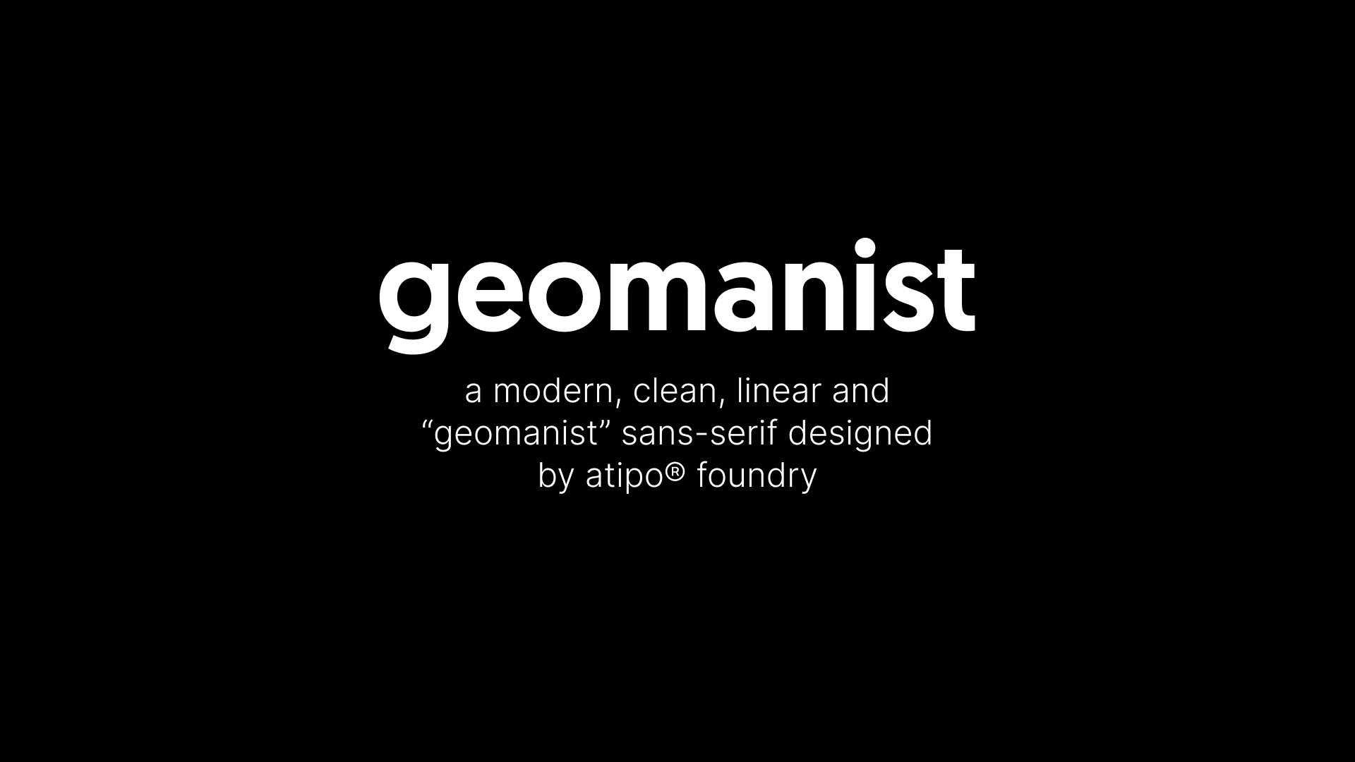
Geomanist has a contemporary sans design, clean and elegant, with a combination of geometric shapes and humanistic beat.
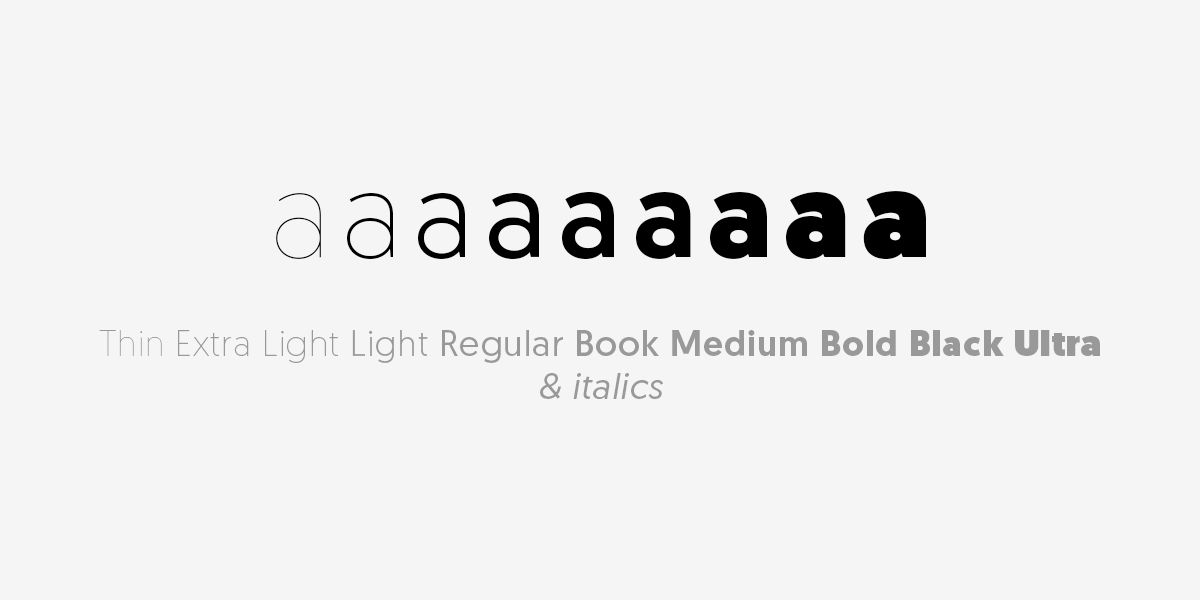
About Geomanist Font
Geomanist was crafted by Atipo®, a compact yet versatile studio founded in 2010 by Raúl García del Pomar and Ismael González. Atipo® specializes in providing lasting and sincere graphic solutions, prioritizing innovative ideas over mere aesthetic appeal.
The exquisite Geomanist typeface is available in 18 distinct font styles, ranging from the gracefully slender Thin weight to the robust and impactful Ultra. Each style is appealing and visually delightful.
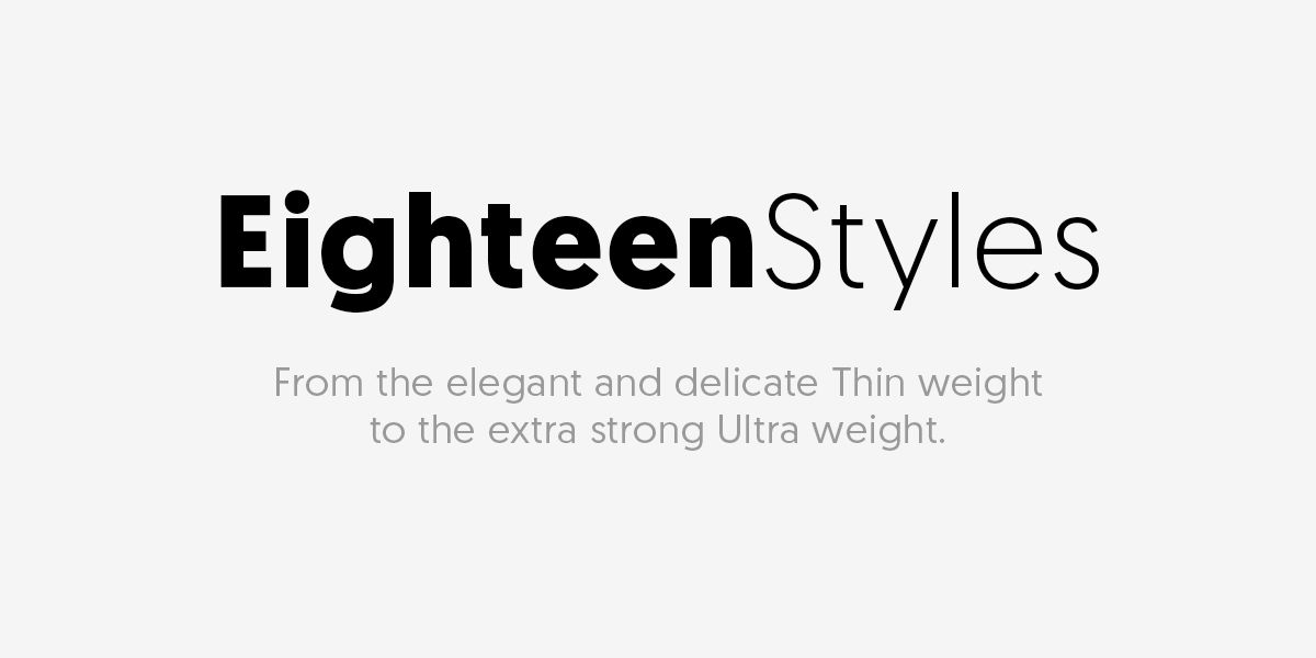
Geomanist was designed in 9 font weights, with an italic version.
Geomanist is versatile for both personal and commercial projects, and it’s also web-friendly for enhancing your website or. You can download the regular font style for free, and the entire font family is readily available for more diverse typography options.
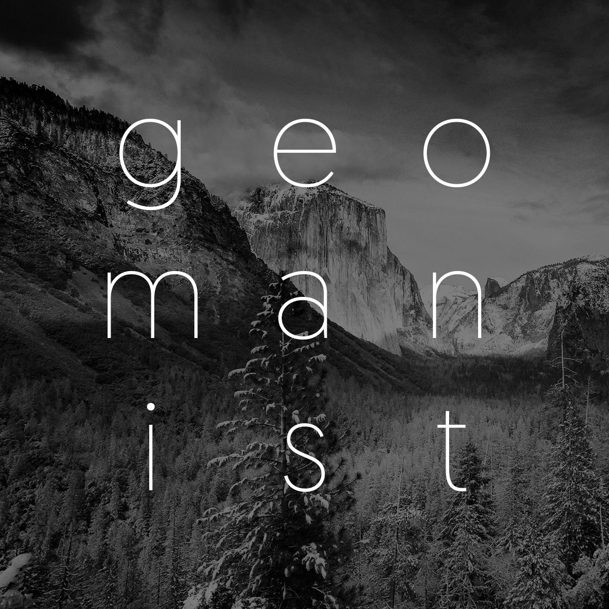
Geomanist can be used to design something special, like this:

Disclaimer: I have no affiliation with Geomanist, its founders, or their associates. Rest assured, there has been no financial transaction involved in my endorsement. I am simply an admirer, eager to contribute positively to the design community. Namaste.